Table of Contents
Key Questions Answered
- What is the category composition of my brand based on total sales? What is my competitor's composition?
- How has each category impacted my YOY sales?
- My competitor recently launched a new product. How has that impacted their performance in that category?
- How are my main competitors performing compared to my brand in all of the markets that I sell in?
- How have my brands sales changed over the past year compared to the total market?
- Am I price above or below the market average?
Controls
At the top of each brand performance page, you are able to jump across the different topics by selecting the topic of interest

The brand filter has been moved to it's own row above the filter panel. This is done as visuals will return null or reflect total market unless a brand is selected.
![]()
Brand Performance
State Overview


Track sales, rank, and share by state both at a point in time, as well as trending.
- Hover over a state in the map to get additional information on rank and total sales
- Rank and share will be reflective of the selected metric
- I.e. if the "Select Metric" tab is set to "Retail Sales", rank and share will be based on dollar sales. If either of the unit metrics are selected, then rank and share will be based on unit sales.
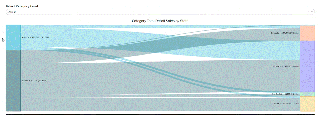
Compare state performance and % of the brands portfolio by category
- Hover over a state or category to follow the share of the state into each category, or the share of each category into each state
Category Overview

Track period over period changes in category sales as well as the sales difference vs YA
- PY total for the chart on the right represents the same selected period the year prior
- i.e. if the filter is selected to Jan-Nov of 2023, PY total will be total sales for Jan-Nov 2022
- Each bar above a category is the difference in sales vs the previous year, all totally to the CY (current year) total.
- If the value is red, that's a decline vs the year prior, if the value is green, it's an increase vs the year prior.

Compare share and rank for the brand for each category that it sells in.
Assortment Overview

View a snapshot of the brand's portfolio of categories to see what category is the strongest and compare with the relationship between product expansion's impact on sale's
- For example, the above brand looks to have retired products that may have not been working well for them, leading to an overall increase in total sales by focusing on successful items
- Filter to a specific category to evaluate where potential product innovation may lead to the most increase in sales, as well as what categories may be oversaturated with products.

Elaborate on the relationship between number of products and total sales by comparing the contribution of total products in the brand's portfolio to the total sales contribution.
- For the above brand, they have a large and growing percentage of their products in the extract category, but they sell a very small percentage of their portfolio. This could be something for the brand to evaluate further if the cost of having so many products in that category is worth the sales return, or if there's opportunity to optimize that category.

Another impact on a brand's total sales in a category is the relationship with price. Evaluate how price affects total sales by comparing the metrics across category.
- For example, the above brand has an inverse relationship between price and total sales. It may be worth the brand evaluating their price positioning and possibly lowering their ARP to increase sales.

Track the trending sales of the top performing products, including retail sales, units, ARP, and the share of total brand sales.
- Top products are reflective of total time period, so if the date range is selected to past 12 months, it's the top x products over the entire 12 month period.
Competitive Analysis
How to Add Brands
Visuals will update as more brands are selected in the brand filter. Brands will be added to the legend of visuals as more are selected

will result in this legend on the visual:

Brand Overview


Compare trending sales, share, and rank for all selected competing brands.
- Share and rank will be based on the selected metric, so if the "Select Metric" button is on retail sales, it will be dollar share and rank, if it's on either unit metric, it will be unit share and rank.
State Comparison

Compare share in each state that the selected brands sell in.
- Can be used to compare share in states that all brands sell in, but also look at other states the brands sell in to evaluate possible market expansion and barrier to entry.

Compare rank of each brand in states they sell in.
- Formatting is based on if rank increases or decreases period to period
- First period will always have no formatting, and from there if the rank is lower in the next period it will be formatted red, if rank is higher it will be formatted green, and if it stays the same it will be formatted yellow.
Category Comparison

Compare total category portfolio across the selected brands.

Similar to state share, compare the category share across the selected brands by evaluating both competition in existing categories, as well as potential product expansion into new categories that competitors are already in.

Compare rank of each brand in categories they sell in.
- Formatting is based on if rank increases or decreases period to period
- First period will always have no formatting, and from there if the rank is lower in the next period it will be formatted red, if rank is higher it will be formatted green, and if it stays the same it will be formatted yellow.

Use the chart on the left to look at the price distribution of the selected brands by category to analyze how concentrated prices are in each category. Compare to the chart on the right to see where each brand falls in the price distribution.
- Use to benchmark if the brand of interest is similarly priced or an outlier compared to competing brands.

Further compare pricing by looking at the number of products for the brand in each price tier vs the contribution of sales in each category.
- Use to see if the products in each tier align with where the majority of sales fall.
- For example, the last brand in the list has a good percentage of their products selling at the value price point, but when compared to where their sales are, those value products make up a small portion of sales. This could mean that those products that fall in value could be gaining incremental sales at a higher price point.
ROM Comparison
Snapshot

Use the gauges to benchmark where the selected brand sits vs the average, as well as compared to the highest and lowest brand.
- Each gauge ranges from the brand with the lowest sales/ARP to the brand with the highest.
- The "Brand Benchmark" is represented by the black like. This is the average sales of all brands to use as a benchmark.
- The arrow represents where the selected brand sits. If the purple bar exceeds the black line, the selected brand is outperforming in sales or priced higher than the average brand. Is the purple bar is below, it's is under performing or priced lower than the average brand.
Tip: we recommend being very specific with filters when benchmarking. Something may be outselling due to selling in a larger category, more states, etc. To get the most accurate benchmark, utilize the filters.
Brand vs ROM sales

The right and left graph are used to compare the % change period to period of a brand vs the ROM (rest of market)
- "Rest of Market" represents the entire market excluding the selected brand.
- The visual on the left is comparing period over period sales as a whole for the brand vs the ROM. This can be a helpful tool to explain if fluxes in brand sales are isolated to the brand or an overall market trend.
- The visual on the right is used to look further at trends by breaking out the brand into categories that they sell in.
- Each bar is the % change for the brand - the % change for the ROM category.
- If the value is greater than 0, then the brand exceeded the category % change
- If the value is less than 0, the category exceeded the brand % change.

Compare the selected brand's trending total total compared to that of the Brand Benchmark (sales for the average brand), as well as benchmarking vs Multi-State brands and Single State brands.

Break out the benchmarking even further by comparing across categories that the brand sells in.
- Even though the selected brand is overall benchmarking higher than average, it's mostly driven by their vape products while their other categories fall behind average.
Brand vs ROM Pricing

Use the left visual to compare overall trending ARP data for the brand vs ROM, Multi-State Brands, and Single State brands.
Use the right visual to index by category vs the ROM
- Index measures the % above or below average, represented by distance from 100
- If a brand is indexed exactly at 100, then it's priced exactly the same as the market. If the index is 105, then it's 5% above the market. If the index is 95, then it's 5% below the market.
- The above brand is priced significantly higher than the category average for devices and extracts, while it's priced below average for Extracts and Vapes.
- This can be used in conjunction with the sales benchmarking to see if pricing over or under indexing is correlated with sales positioning vs the average brand.