
Follow trending availability, velocity, list price, and discounting across BDSA tracked markets
Table of Contents
Key Questions Answered
- How has my brand's availability changed over a period of time?
- What is the difference between my products' average listed price and the average paid-for price?
- As I have grown the distribution of my product, are my sales per store increasing?
- As I have added more products in a specific category, have my sales per store increased?
- Is there a specific time of year when my competitors are discounting heavily compared to the list price? Is it resulting in an increase in sales per store for them?
- Where are the gaps in my competitor's availability over time so I can strategize where to try and stock my product?
Overview
Publishing Cadence
To provide such deep insights, the product leverages brand and product level data from BDSA's Retail Sales Tracking. Depending on the level of granularity, some information may not be available in line with the Menu Analytics publishing cycle. To ensure data quality while still providing data as quickly as possible, expect some metrics to align with other publishing cycles.
| Metrics | Product Alignment | Publishing Cadence | Lag |
| Availability, List Price, High/Low Price |
Aligned with Menu Analytics publishing cadence | Refreshes every Monday for the Mon-Fri of the previous week | No lag |
| Velocity, Purchase Price (brand level) |
Aligned with Rapid RST publishing cadence | Refreshes every Thursday for the Mon-Sun 2 weeks prior | 2 week lag Mon-Wed, 1 week lag Thur-Sun |
| Velocity, Purchase Price (product level) |
Aligned with Enhanced RST publishing cadence | Refreshes monthly for the prior complete month | 5-9 week lag |
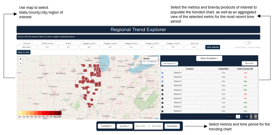
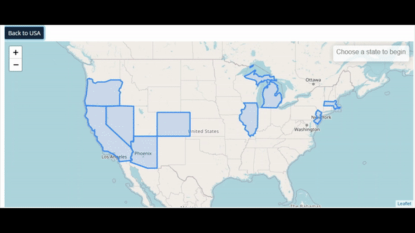
Mapping
You can use the heat map to drill in from the state to the city. Other charts will only populate once a state is chosen.
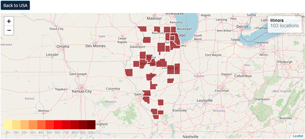
Keep track of what region you're looking at and the number of dispensaries in that location using the label in the top right corner.
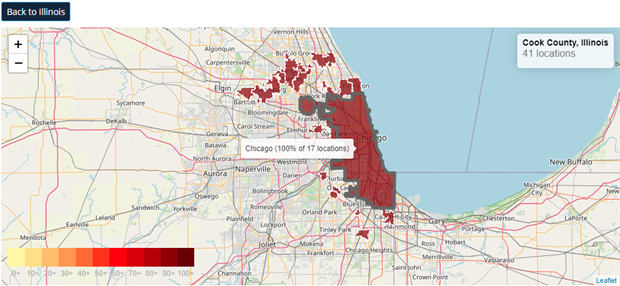
Hover over a region to see the total number of dispensaries in that area.
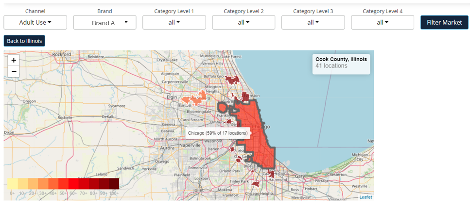
The heat map scale measures the percentage of locations that fit the parameters set in the filters.
-
For example, setting the Brand filter to Brand A and hovering over Chicago tells us that 59% of the 17 Adult Use locations in Chicago sell Brand A products.
Metric and Brand Selection
Metric and brand selection provides a quick insight into the most recent week of data for the selected metrics and controls what brands or products will populate the trended charts below. By default, three brands/products will be selected to keep the trended chart easy to read, but you can select all desired.
Tip: Be as specific as possible with categories and pack sizes to get the most accurate comparison when running competitive analyses, especially for pricing.
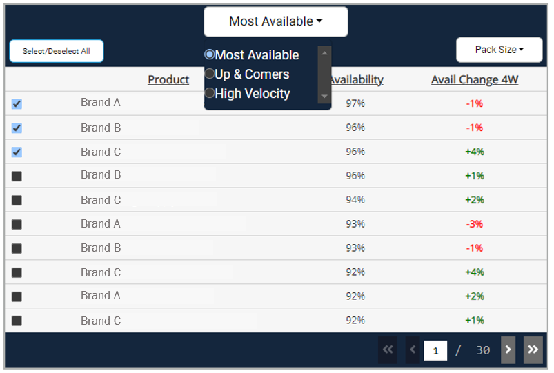
Use the top filter bar to select which metric to populate the chart.
Note: all metrics are reflective of the most recent data available
- Most Available
- Availability measures the percent of all locations in the defined region that sells the brand or product.
- Check the label in the map's top right corner to reference the number of doors for availability.
- Ex: if out of 100 total locations, 50 of them sell the specified product, the Availability will be 50%.
- Up & Comers
- The percentage point change in brand or product availability in the last four weeks.
- Note that this is not the direct percent change in Availability.
- Ex: if a product’s Availability is 50% and four weeks later the product’s Availability is 60%, then the Availability Change 4W will be +10.
- High Velocity
- Daily velocity measures the average sales per retail location per day at the state level.
- Velocity provides more context to a brand's total sales in the state. While sales can give you an idea of a brand or product's total performance, velocity accounts for how many stores the brand or product sells in.
- Because velocity is calculated at the state level, it will not change when filtering more granularly into a market.
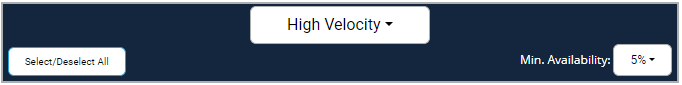
Selecting the High Velocity table will add an option to set a minimum availability for products.
- The minimum availability filter allows users to toggle to only see the velocity for brands and products that are greater than or equal to a certain percentage of distribution.
- This is helpful for filtering out brands that may have exclusive partnerships or are owned brands of a dispensary that sell very well, but are only in a few locations. This can result in a very high velocity, but a brand that is more focused on wholesaling may want to filter these brands out and focus more on brands that are wholesaling widely as well.
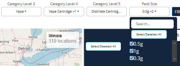
Use the Pack Size filter to get apples-to-apples comparisons of brands
- The Pack Size filter will align with available pack sizes for the specified category
- Ex: is I'm filtered to vape cartridges in IL, my Pack Size options will be 0.3g, 0.5g, and 1g
Tip: Be as specific as possible with categories and pack sizes to get the most accurate comparison when running competitive analyses, especially for pricing.
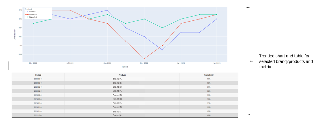
Trended View
The trended view visualizes availability, pricing, and velocity over time based on the selected brands/products from the table above.
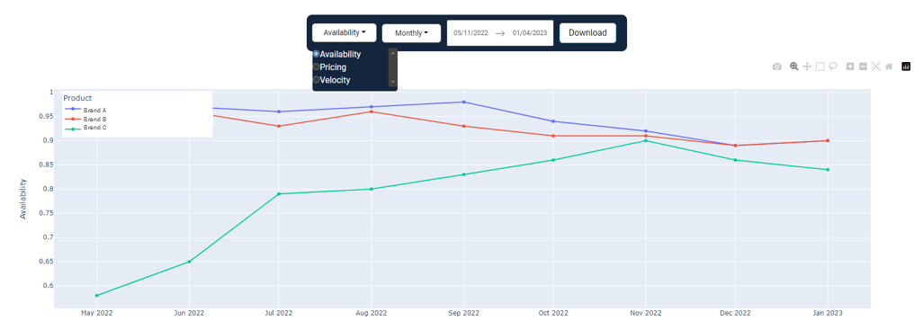
Use the metric selector to choose what you would like to visualize:
- Availability measures the percent of all locations in the defined region that sells the brand or product.
- Pricing measures both the regional listed price and the statewide sell-through price.
- Velocity measures the average sales per retail location per day at the state level.
The chart also allows you to select a time period and how you would like the time period aggregated.
- By week, month, or quarter
Use the download button to export the trended data to do your analysis.
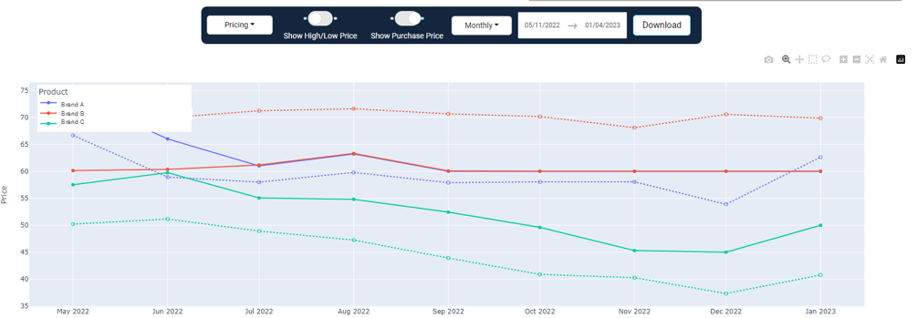
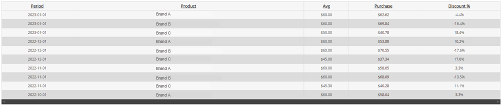
Pricing provides additional options like purchase price and high/low price
- The purchase price is the price tracked through BDSA's retail sales tracking, which is the pre-tax post-discount price that the specified brand/product is sold for.
- The dotted line represents the purchase price.
- This view provides insight into how steep your products and your competitor's products are discounted on average compared to the price listed on menus.
- In the above example, Brand C consistently sells 10-20% less than the price listed on Menus, while Brand B sells higher than what is listed on average.
- Because purchase price is weighted by units sold, this could mean a higher concentration of customers willing to purchase Brand B at a higher price point rather than seek out a lower price elsewhere. A dispensary selling this brand may increase its prices to capture incremental dollar sales based on customers' willingness to pay more.
Note: Clients need to be subscribed to RST to be able to see purchase price.
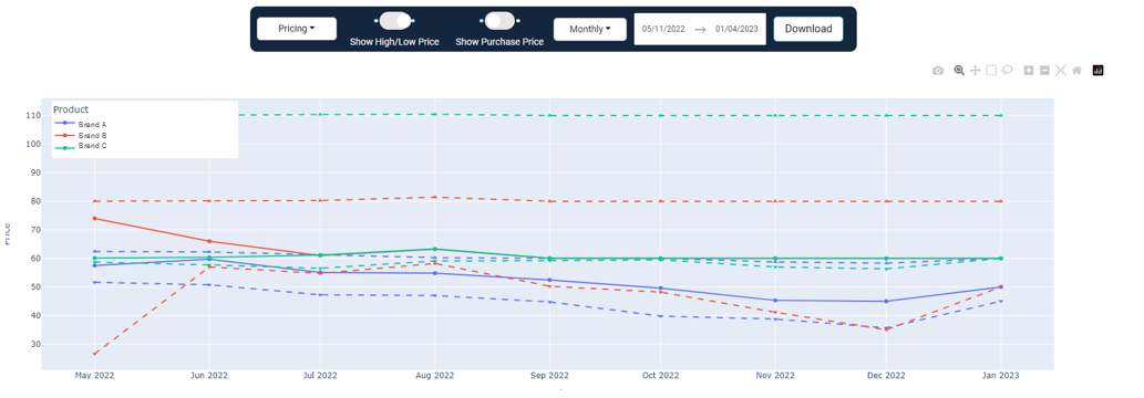
Pricing also can show high and low listed prices:
- The high price is the 95th percentile listed price of the brand or product.
- Low price is the 5th percentile price of the brand or product.
- The thick dotted line represents high/low prices.
High and low prices are crucial to understanding the distribution of prices for a brand or product.
- Using the above example, Brand C's average price is consistently within a few dollars of their low price. As a competitor, I then understand the concentration of their listed prices toward that lower price point rather than evenly across high and low.
- This price distribution, paired with their purchase price and velocity, can help me optimize my pricing strategy.
- Tracking my competitor's velocity over time can help inform me who is growing and shrinking in the market. Overlaying how their price concentration and discounting have changed over time can guide how their pricing strategy has impacted their sales.
View the same information in a table format and easily export to a .csv using the download button above the trended chart.